An often missed opportunity in showcasing how your app delivers on its promises, a worthy dashboard shortcuts users to meaningful takeaways and actions, helping them make crucial decisions.
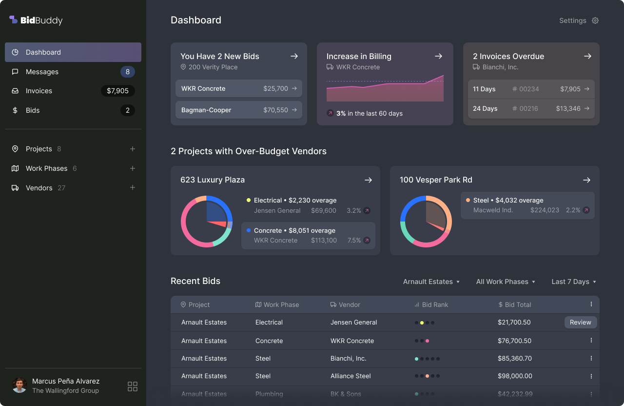
Don't overload your users with ChartJunk! An actionable dashboard is not about reporting, but about clarifying what to do next.
The Reality
Every app has a dashboard, and yours is no different. But what’s it doing for you?
You offer users charts and reports, but it’s not the core value of your promise.
You quantify user activities, but don’t know how or if they use this information.
Common UX Issues
Lots of charts are being shown without takeaways, assuming they are obvious.
Over-reporting activity teaches users to mistrust and disregard your alerts and notifications.
It doesn’t help users understand the app’s real purpose or funnel them toward key actions.
What’s measured doesn’t change much over time and is stating what users already know.
Dashboard Design Principles
Highlight numbers that relate to customer desires, or back up real insights.
Direct people to screens and activities that are relevant right now.
Relocate small metrics, like the number of projects, even if they help balance things.
Hide modules that haven’t changed in awhile or aren’t saying something new.
Discovery Questions
Who is this app for? What are they trying to accomplish?
How do users relate to each other? How do actions differ by role?
Where does the data originate? How do users interact with it?
Where do users spend their time? How often do they engage?
Let’s talk about how your dashboard can become the advocate your app needs to keep users coming back.
Our work is quality. But you don't have to take our word for it.
Concise, achievable objectives. No creep. No drift. No surprises.
We check in afterward, ensuring our designs work in reality.
Let’s talk about your immediate challenges, and how we can target them with a limited effort.
Book an Intro Call Email Us Directly